Could Smarter Interior Painting Be Changing How Chatham Homes Feel?
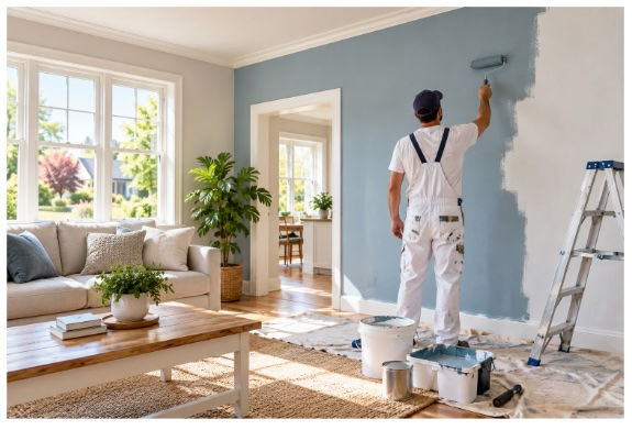
The way a home is painted can influence far more than its appearance. Increasingly, homeowners are paying closer attention to colour psychology, durable finishes, low-VOC products, natural light, and the relationship between different rooms when planning painters in Chatham Kent for a property. Rather than treating decoration as a purely cosmetic decision, many Chatham residents are approaching painting as part of a broader effort to create comfortable, practical, and visually cohesive homes. This shift is particularly noticeable as homeowners look for ways to refresh established properties without undertaking major renovations.
Why Thoughtful Painting Is Becoming More Important in Chatham Homes
Paint has traditionally been one of the simplest ways to change the appearance of a room. A fresh coat can cover scuffs, revive tired surfaces and introduce a completely different atmosphere. Today, however, expectations are considerably higher. Homeowners want finishes that remain attractive despite everyday use, colours that work naturally with existing furnishings, and surfaces that are easy to maintain.
Properties throughout Chatham can also present very different decorative challenges. Older houses may contain traditional architectural features, uneven walls, timber details or rooms with limited natural light. Modern properties often have open-plan layouts where one colour choice can affect several connected spaces. Professional painting therefore involves more than selecting a shade from a colour chart.
A considered approach begins with the character of the property itself. Wall proportions, ceiling height, window placement, flooring, furniture and daylight can all influence how a colour ultimately appears. The same neutral tone may feel warm and inviting in a south-facing room but considerably cooler in a darker hallway.
The Growing Preference for Natural and Calming Colour Palettes
One noticeable development in contemporary residential decoration is the continued popularity of colours inspired by nature. Soft greens, muted blues, warm creams, earthy beige tones and gentle terracotta shades are being incorporated into interiors because they can create a relaxed atmosphere without overwhelming a room.
Neutral decoration has also become more sophisticated. Instead of relying exclusively on brilliant white, homeowners are increasingly considering warmer whites, stone shades, mushroom tones and subtle greiges. These colours can provide a restrained background while allowing artwork, furniture, timber and textiles to remain visually prominent.
For Chatham homeowners, this approach can work particularly well in properties where architectural details deserve attention. A restrained wall colour can allow decorative mouldings, fireplaces, doors or exposed timber features to become focal points rather than competing with the surrounding decoration.
Colour can also be used to establish subtle distinctions between areas. In an open-plan kitchen and living space, for example, carefully selected tones can create visual separation without making the rooms feel disconnected.
How Light Changes the Final Appearance of Paint
Colour selection should never be based solely on how a sample looks under artificial lighting. Natural daylight changes throughout the day, and this can significantly affect painted surfaces.
Morning light may reveal cooler undertones, while afternoon sunlight can make warm colours appear richer. Rooms facing away from direct sunlight can produce an entirely different result. Artificial lighting adds another variable, particularly where warm bulbs are used in bedrooms, living rooms and dining areas.
For this reason, professional decorators often assess colours in the actual environment where they will be used. Large sample areas can reveal subtle undertones that are almost impossible to identify from a small colour card.
The surrounding surfaces matter too. Dark flooring may make walls appear lighter, while pale furniture can create a stronger contrast. Curtains, carpets, kitchen cabinetry and natural timber can all influence the perceived colour.
Durability Is Becoming Just as Important as Appearance
A beautiful finish has limited value if it quickly becomes marked or difficult to maintain. This is why modern residential painting increasingly considers the practical demands placed on individual rooms.
Hallways and staircases experience considerable traffic and can be exposed to fingerprints, knocks and everyday abrasion. Kitchens may encounter moisture, cooking residue and occasional splashes. Bathrooms require finishes appropriate for humid environments, while bedrooms generally experience less demanding conditions.
Choosing the appropriate paint finish for each space can make a substantial difference. Washable and durable formulations may be particularly useful in busy areas, while softer finishes can create an understated appearance in rooms where walls receive less contact.
Preparation is equally important. A high-quality decorative finish depends heavily on the condition of the surface underneath it. Cracks, flaking paint, stains, holes, and uneven patches can remain visible if they are simply covered rather than properly addressed.
Surface Preparation Is Where Quality Often Begins
Professional painters in the area typically devote considerable attention to preparation because it establishes the foundation for the finished result. Walls may need cleaning, sanding, filling, priming, or sealing before the final colour is applied.
Small imperfections can become surprisingly obvious after a new colour has been added, especially when the chosen finish reflects light. A smooth, properly prepared wall distributes the paint more consistently and produces cleaner visual lines.
Woodwork requires its own treatment. Skirting boards, doors, frames and stair components may need preparation to remove previous coatings, repair damage and create an appropriate surface for the new finish.
Good preparation can also improve the longevity of the decoration. Paint that is applied to a dirty, unstable or poorly prepared surface is more likely to deteriorate prematurely.
Using Different Finishes to Create Subtle Contrast
A room does not necessarily need multiple colours to achieve visual depth. Different paint finishes can create understated contrast while maintaining a consistent palette.
For example, walls with a low-sheen finish can be paired with more durable satin finishes on woodwork. Ceilings may use a flatter appearance, helping them recede visually, while doors and trim can provide definition.
This technique is particularly useful in traditional properties, where architectural elements can benefit from subtle differentiation. Rather than introducing numerous competing shades, homeowners can create sophistication through variations in texture, sheen, and tonal intensity.
The result can feel deliberately designed without becoming overly decorative.
The Role of Painting in Refreshing Older Properties
Painting can be especially transformative in established homes. Over time, repeated decoration, furniture movement and ordinary household activity can leave walls looking tired even when the underlying property remains in good condition.
A carefully planned redecoration can modernise an interior without removing the features that give the property its identity. Original doors, fireplaces, timber details and decorative mouldings can be retained while surrounding surfaces receive a contemporary treatment.
This balance between preservation and modernisation is becoming increasingly relevant as homeowners seek practical improvements without completely redesigning their homes.
Colour can also help emphasise period features. A contrasting trim can draw attention to architectural details, while a closely matched palette can create a quieter and more unified effect.
Why Professional Attention Can Produce a More Consistent Finish
Painting appears straightforward until a large area exposes every inconsistency. Uneven coverage, visible roller marks, brush lines, rough edges and poorly finished corners can undermine an otherwise attractive colour scheme.
Experienced local painting contractors understand how different surfaces respond to preparation and application. They can also work methodically around windows, doors, skirting boards, fixtures and architectural details.
Consistency is particularly important where several connected rooms are being decorated. A colour that appears attractive in isolation still needs to work alongside adjacent spaces. Careful planning helps prevent abrupt transitions and allows the entire property to feel visually connected.
Professional application can also make a difference to the appearance of large walls. Broad surfaces reveal imperfections more readily, meaning technique and preparation become increasingly important as the scale of the project grows.
A More Considered Future for Residential Decoration
Residential painting is moving beyond the idea of simply changing wall colour. Homeowners are considering how decoration interacts with natural light, household routines, architectural character, maintenance requirements and the atmosphere they want to create.
For properties around Chatham, this can mean combining traditional character with contemporary colour choices, durable finishes and carefully considered preparation. A restrained palette may provide a timeless foundation, while carefully selected accent colours can introduce personality where appropriate.
The strongest results often come from decisions that appear relatively subtle. The right undertone can make a dim room feel more balanced. A durable finish can make a busy hallway easier to maintain. A carefully prepared surface can make an ordinary colour appear considerably more refined.
As interior trends continue to favour comfort, individuality and longevity over short-lived decoration, painting remains one of the most practical ways to influence the character of a home. When colour, preparation, finish and architectural context are considered together, a relatively simple decorating project can give a property an entirely different sense of freshness, proportion and atmosphere.