Mirrors as Design Tools: How Designers Use Them to Double Light and Space
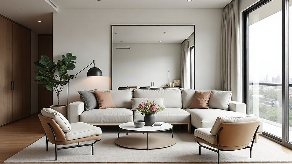
Ask an interior designer to name the most underused tool in residential styling and there is a fair chance they will say the mirror. Not the little round one propped on a shelf for a final outfit check, but mirror used deliberately, at scale, as an instrument for moving light around a home and stretching the perceived boundaries of a room. Used well, a mirror is closer to a window than a decoration. It borrows a view, doubles a light source, and quietly corrects the proportions of an awkward space.
The trick is that none of this happens by accident. Designers place mirrors the way they place lighting, with intent, and the difference between a mirror that transforms a room and one that just hangs there comes down to a handful of decisions about position, scale, and specification.
Placement: put the mirror to work
The classic move is to position a mirror opposite or adjacent to a window. The mirror picks up the daylight and the view, and effectively gives the room a second aperture. In a south-facing living room that never quite gets direct sun, a generous mirror on the wall facing the glazing can lift the ambient light noticeably through the day. You are not adding light, you are recirculating it, and the eye reads the room as brighter and more open.
Dark hallways are the other obvious candidate. A corridor with no natural light of its own can borrow it from the rooms at either end. A full-height mirror at the terminus of a hallway also resolves one of the least loved conditions in residential design, the dead-end sightline. Instead of walking towards a blank wall, you walk towards depth.
Above the mantel remains the most traditional placement, and it endures because it works. The mantel gives the mirror a datum to sit on, the chimney breast gives it a frame within the architecture, and the mirror in turn reflects the ceiling and upper walls, drawing the eye up and making the room feel taller.
One caution: a mirror doubles whatever it faces. Before fixing anything, stand where the mirror will hang and check the reflection. A view of the garden is a gift. A view of the laundry door is not.
Scale and proportion
If there is one consistent mistake in how homeowners use mirrors, it is timidity. A small mirror on a large wall reads as an afterthought, a lonely object floating in space. Designers almost always scale up. A mirror that spans the width of a console, or runs the full height of a wall, reads as an architectural element rather than an accessory, and it is the architectural reading that produces the space-doubling effect.
Proportion matters as much as raw size. Over a mantel or a console, a mirror roughly two-thirds to three-quarters the width of the piece below it feels anchored. In a bathroom, running the mirror the full width of the vanity, wall to wall where possible, is almost always the stronger move than two small ovals, however charming they look in isolation.
Framed or frameless
The frame decides what job the mirror is doing. A framed mirror behaves like art. It has presence as an object, it suits traditional and transitional interiors, and a substantial frame in timber or aged brass can carry a wall on its own. A frameless mirror behaves like architecture. With polished or bevelled edges and no visual border, it dissolves into the wall, which is exactly what you want when the goal is pure light and spatial expansion rather than decoration.
As a rule of thumb, choose framed when you want the mirror noticed, frameless when you want the room noticed.
Custom cut versus off the shelf
Off-the-shelf mirrors are fine for standard walls and standard budgets, but the moments where mirror really earns its keep are rarely standard. Wall-to-wall bathroom runs, mirrors scribed around switches and tapware, angled pieces following a stair, splashback-height mirror behind a bar nook, all of these need glass cut to the actual dimensions of the space. This is where a professional glazier comes in; specialists in mirrors Melbourne homeowners can have cut to size will template the space, allow for out-of-square walls (most walls are), and finish the edges properly. The difference between a stock mirror wedged into an alcove and a custom piece cut to fit it is the difference between furniture and joinery.
The return of the mirror wall
Mirrored walls and panelling spent a few decades in style exile, tainted by memories of smoky bronze panels and gymnasium glare. They are firmly back, but the new generation is more disciplined. Think full-height panels in a dining room reflecting a garden, mirror set into wardrobe fronts as flush panelling, or antiqued mirror used behind shelving where its softened, foxed reflection adds depth without literal duplication. The comeback works because designers now treat mirrored panelling as a wall finish, planned into the room, rather than a novelty applied to it.
The practical specification
A few specs separate a mirror that lasts from one that disappoints. For wall mirrors of any size, 6mm thickness is the common standard; it stays flat and avoids the subtle funhouse distortion thinner glass can show across a large span. Quality mirrors carry a vinyl safety backing, so that if the glass is ever broken the fragments stay adhered to the film rather than falling. In bathrooms and other wet areas, glazing must also comply with the Australian standard for glass in buildings, AS 1288, which is one more reason large or unusual installations are worth handing to experienced glaziers Melbourne residents can call on rather than treating as a weekend job.
The takeaway
A mirror is the rare styling element that changes the physics of a room, or at least the perception of them. Place it where it can capture light and a worthwhile view, scale it generously, choose framed or frameless according to whether it should read as object or architecture, and specify it properly. Do that, and one piece of glass will do the work of a renovation.